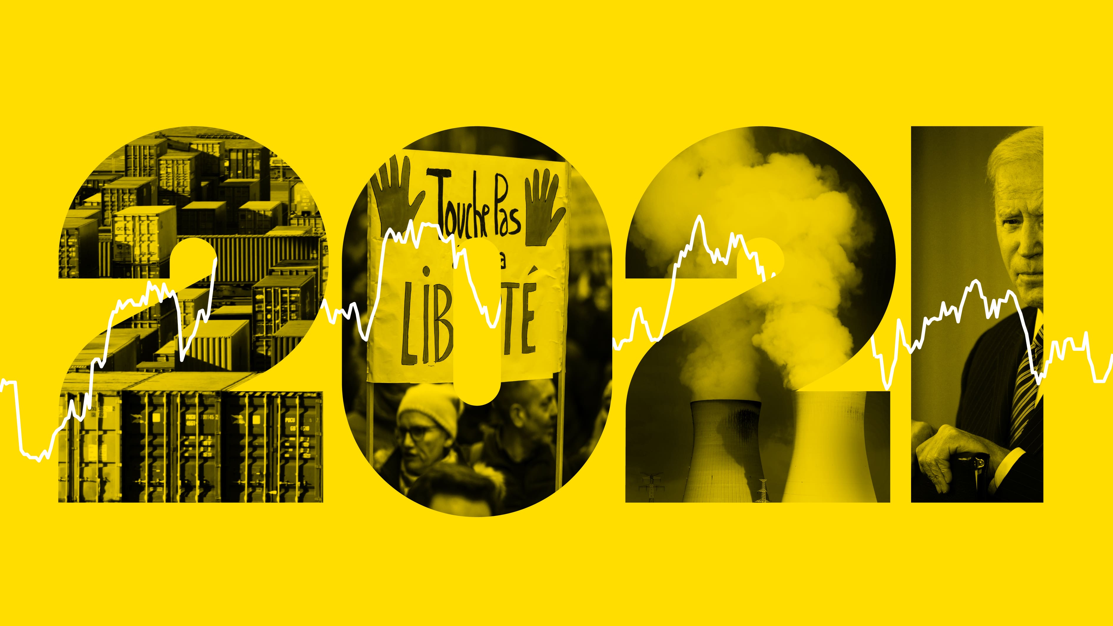
The list of 2021 visualization lists
Published by Reblogs - Credits in Posts,
The list of 2021 visualization lists
The list of 2021 visualization lists
December 29, 2021
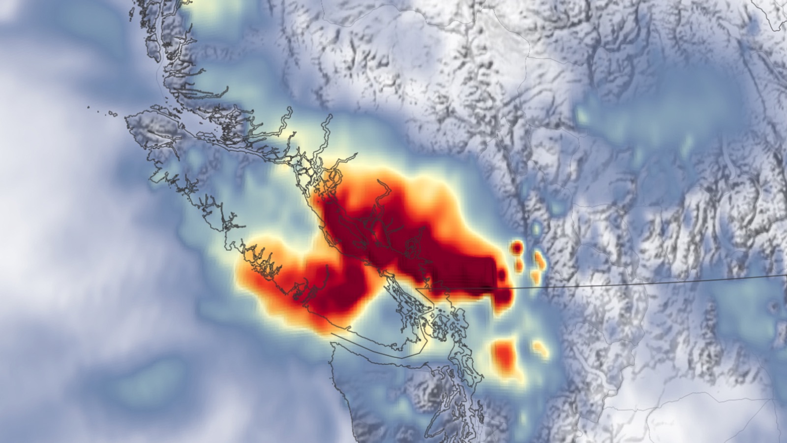
Following a yearly habit: this is the seventh edition of the list of visualizations, charts, graphics, maps, data and satellite journalism and science photography lists, version 2021.
Previous Lists: 2015, 2016, 2017, 2018, 2019 and 2020.
Lists of favourites
@kennethfield: Favourite maps of 2021
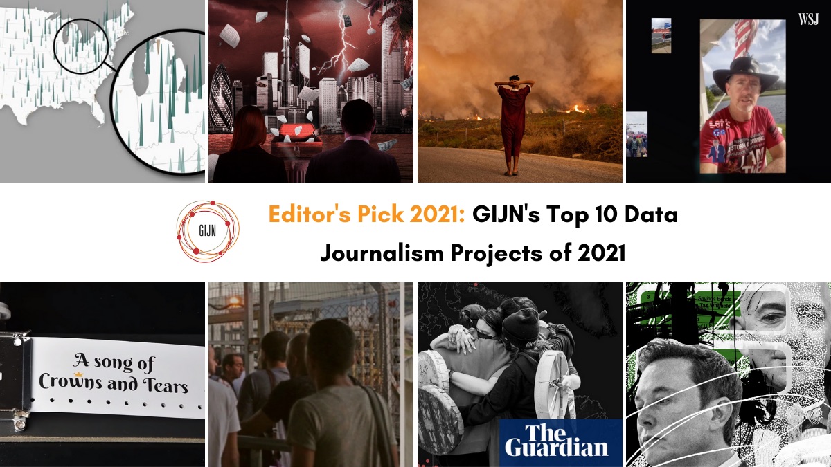
@datajournalism: 12 brilliant data journalism projects of 2021
@gijn: 12 brilliant data journalism projects of 2021
@Nature: The best science images of 2021
Portfolios
@nytgraphics: 2021: The Year in Visual Stories and Graphics
@nytopinion: The Year in Charts
@usatgraphics: A visual dive into 2021’s biggest stories
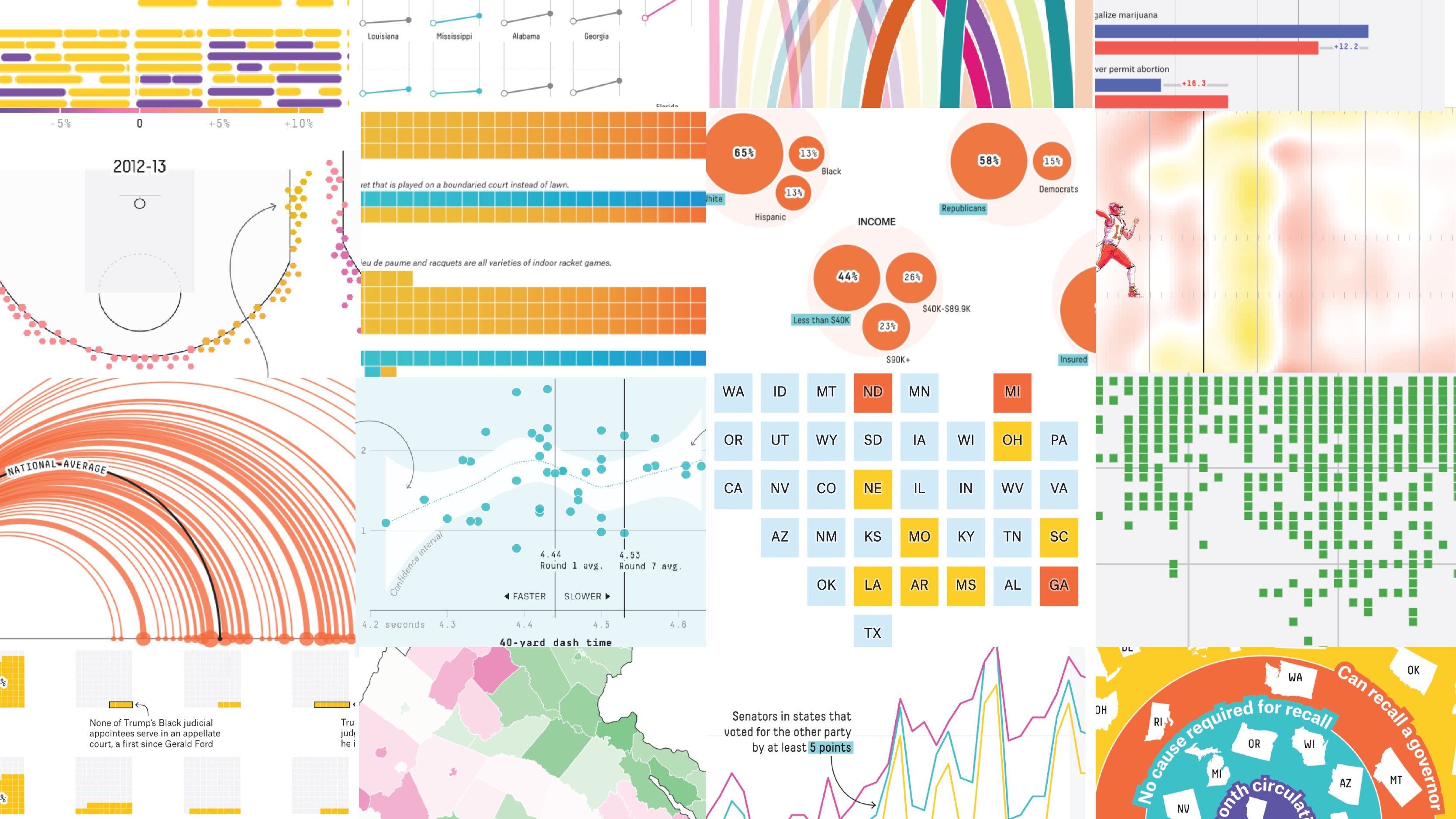
@FiveThirtyEight: Our 51 Best (And Weirdest) Charts Of 2021
@BBGVisualData: 2021, The Year in Graphics
@ftdata: Graphics of the year — making sense of 2021
@f_l_o_u_r_i_s_h: Flourish year in review 2021
@tijdgraphics: Dit nieuwsjaaroverzicht voorspelt de economie
@AtloTeam: 2021 — ATLO’s year in review
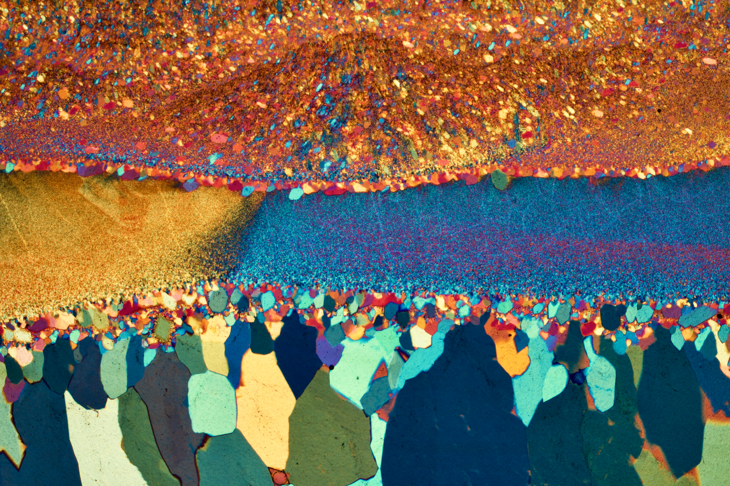
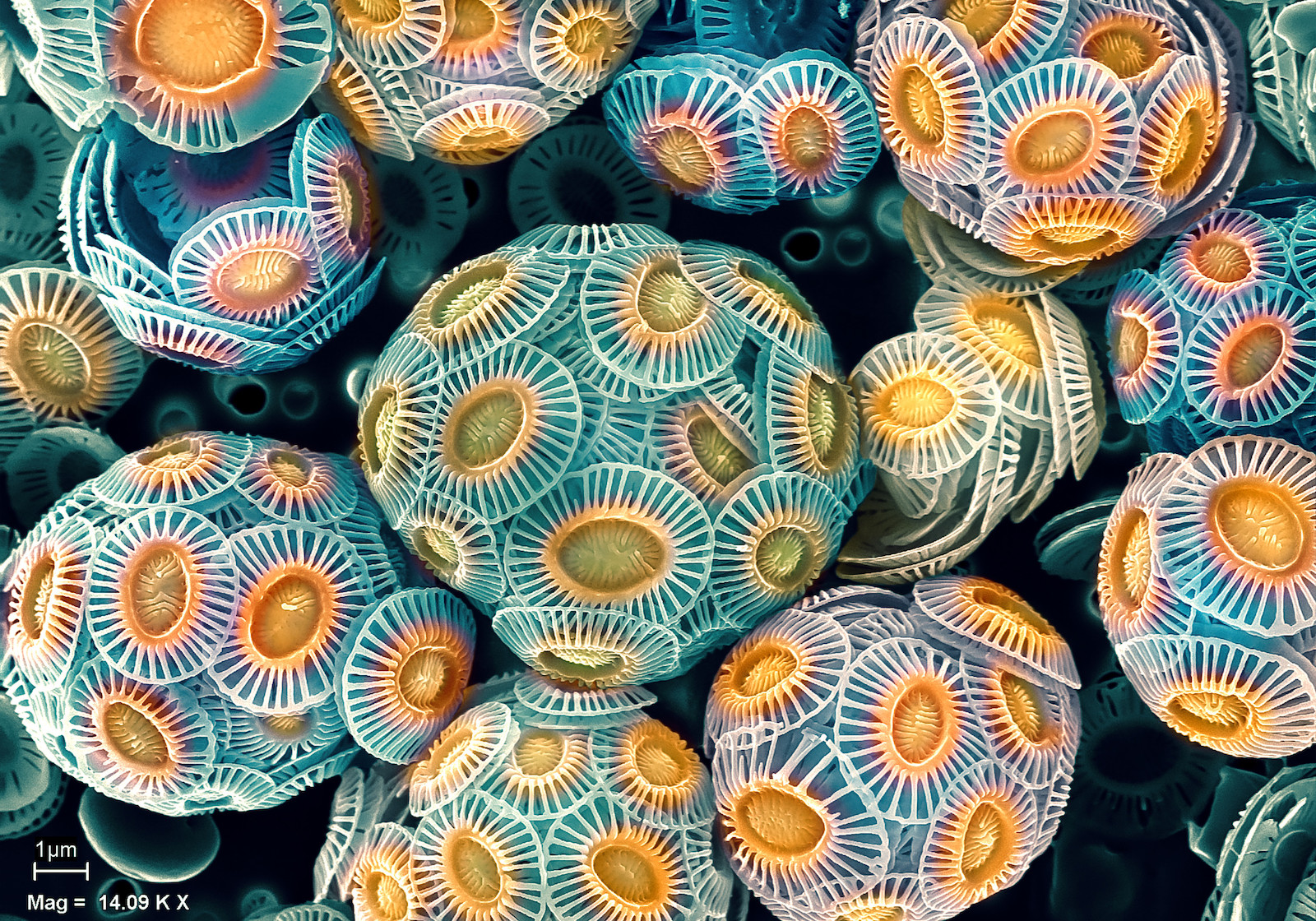
Photomicrography
@nikonsmallworld: 2021 Photomicrography Competition
@banasori (awards organizer): NanoArtography 2021 Award Winners
@zeiss_micro: ZEISS Microscopy Image Contest 2021 Winning Images
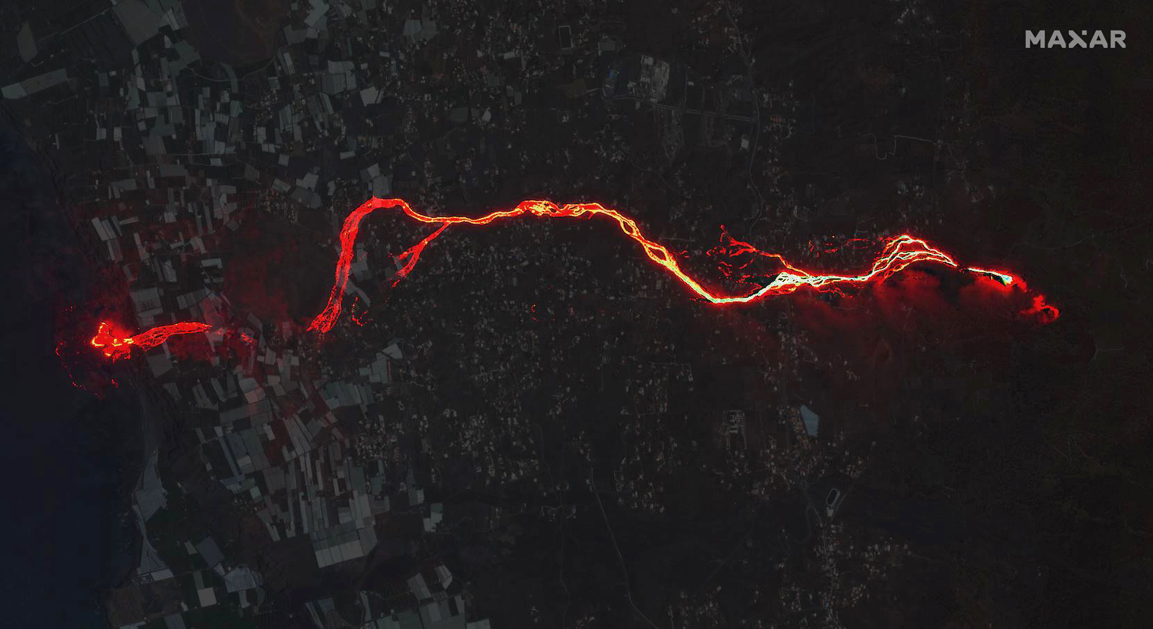
Remote sensing
@planet: A Look Back on 2021 From Above
@maxar: Maxar Satellites Capture the Biggest Global Events in 2021
@Gizmodo: The Most Hellacious Weather of 2021, As Seen From Space
- © Home
- Design: HTML5 UP
- Jekyll integration: Andrew Banchich


